UI
Vantage’s interface is built on UI Toolkit. The package ships a theme and components; your panels and screens are made from them.
Every field, its default and every member you can call: UI reference.
Setup
- Create → UI Toolkit → Panel Settings Asset, and set its Theme Style Sheet to VtDefaultTheme from
Packages/Vantage/Runtime/UI/Themes. - Add a UI Document to the scene and set its Panel Settings to that asset.
The theme sets the colours, the fonts (Inter, and JetBrains Mono for numbers) and the base styles. It does not include Unity’s default control theme; Vantage components and Unity’s built-in controls are styled by the theme itself. Labels stay on one line; add the vt-text-wrap class to text that should wrap. Card titles and descriptions wrap on their own.
Layers
VtUiRoot keeps a screen in order. Add it next to the UI Document and it puts six layers on the document, back to front: World, Hud, Windows, Menus, Overlays and Tooltip. Nameplates stay under the HUD, windows open over it, the game menu covers windows, dialogs and toasts sit over the menu and the tooltip is always in front, whichever order your components add themselves in. Every layer fills the screen and ignores the pointer, so a click between panels reaches the game.
- Select the object with the UI Document and Add Component → Vantage → UI → VtUiRoot.
- Ask it for a layer, or for a corner or edge of the HUD:
var root = GetComponent<VtUiRoot>();
root.Layer(VtUiLayer.Windows).Add(inventoryWindow);
root.Region(VtUiRegion.TopLeft).Add(playerFrame);
root.Region(VtUiRegion.BottomCenter).Add(actionBar);
root.RootRebuilt += AddPanelsAgain;
Regions are created when first asked for. Top regions stack their children downwards, bottom regions upwards, and the centre ones centre them. Vantage’s own controllers find the root on their object and use the right layer on their own: nameplates go to the World layer. The UI Document rebuilds its root on a live reload; the layers are rebuilt with it and RootRebuilt fires so you can add your panels again.
| Part | Class |
|---|---|
| Layers | vt-layers, holding one vt-layer per layer with vt-layer--world, --hud, --windows, --menus, --overlays or --tooltip |
| Regions | vt-region, with vt-region--top-left, --top-center, --top-right, --bottom-left, --bottom-center or --bottom-right |
Navigation
VtUiNavigation is the stack of open screens. Push a window or a dialog and it opens on top; the Cancel input, Esc or the gamepad’s east button, pops the top one, so every screen closes the same way. While anything is open the player’s gameplay input is held: hotkeys, orders, selection, control groups and click-to-move do nothing, so the key that opens a bag does not also cast. A window closed by its own button leaves the stack; a blocking dialog ignores Cancel.
- Add Component → Vantage → UI → VtUiNavigation next to the UI root.
- Open windows through it:
var navigation = VtUiNavigation.Current;
navigation.Open(bagsWindow);
navigation.Toggle(questWindow);
navigation.Push(dialog);
navigation.Pop();
navigation.Clear();
Open puts a window on a layer of the root when it is not on screen yet, then pushes it. The window controllers below open through the stack on their own when the scene has one. Turn Block Gameplay While Open off for a HUD that stays interactive under a window, and Hide Cursor On Gamepad on for a game that hides the mouse cursor while a gamepad drives the menus. From your own code, VtInput.BlockGameplay(owner) and UnblockGameplay(owner) hold the same input for a cutscene or a minigame.
Your own look
Make your own theme style sheet that imports the Vantage theme and adds your rules, and use it on your Panel Settings instead:
@import url("project://database/Packages/com.smartargs.vantage/Runtime/UI/Themes/VtDefaultTheme.tss");

:root {
    --vt-primary: rgb(59, 130, 246);
    --vt-radius: 12px;
}

.vt-card__title {
    font-size: 18px;
}| Variable | Used for |
|---|---|
--vt-background |
The base surface colour. |
--vt-foreground |
Text and icons. |
--vt-muted-foreground |
Secondary text. |
--vt-card-hud, --vt-card-window |
Card surfaces over the game and in windows. |
--vt-border, --vt-ring |
Hairline borders, and borders on hover. Focus uses --vt-primary. |
--vt-primary, --vt-primary-foreground |
The accent, and text on it. |
--vt-destructive, --vt-destructive-foreground |
Deleting and abandoning, and text on it. |
--vt-info, --vt-success, --vt-warning |
Info, success and warning colours, such as the toast icons. Errors use --vt-destructive. |
--vt-success-foreground, --vt-warning-foreground |
Text on a success or warning fill. |
--vt-hover, --vt-track |
Hover highlights, and the empty part of bars. |
--vt-health, --vt-mana, --vt-stamina, --vt-experience |
Resource colours. |
--vt-cast |
The fill of a cast bar. |
--vt-hostile, --vt-friendly, --vt-neutral |
Nameplate bars of hostile, friendly and neutral units. |
--vt-radius |
Corner radius. |
--vt-text-xs … --vt-text-xl |
The type scale: 10, 12, 14, 16 and 20 px. |
--vt-space-1 … --vt-space-4 |
The spacing scale: 4, 8, 12 and 16 px, used for padding and margins. |
--vt-font-regular, --vt-font-medium, --vt-font-semibold, --vt-font-bold |
The text typeface in each weight. |
--vt-font-mono, --vt-font-mono-medium |
The typeface for numbers, and its heavier weight for badges and counts. |
Every size in the theme comes from those two scales, so changing --vt-text-base or --vt-space-3 in your own sheet moves the whole interface at once:
:root {
    --vt-text-base: 16px;
    --vt-space-3: 14px;
}
State classes
Two classes mark state on anything — a chip, a row, a list entry or a button — so one rule covers them all:
| Class | What it does |
|---|---|
vt-is-selected |
Fills with --vt-hover and draws a --vt-primary border, so a chosen element reads as chosen even with the neutral accent. |
vt-is-disabled |
Fades to 40% without disabling the element, for something that looks unavailable but still explains itself when clicked. Call SetEnabled(false) to actually turn it off. |
VtUiStates.SetSelected(chip, index == selected);
VtUiStates.SetDisabledLook(row, !canAfford);
If your own sheet styles the same properties on the same element (a chip class that sets its own border colour, say), give the state rule the extra class — .my-chip.vt-is-selected — so it wins.
Text
VtText is a label whose text is a localization key, or the final text when no table is installed. Everything the package shows a player is one of these, so a language change reaches the screen without the panel rebuilding itself: while the text is on a panel it re-resolves on its own.
<VtText key="quest.title" muted="true" wrap="true" />var line = new VtText("quest.title");
var gold = new VtText();
gold.Set("loot.gold", reward);
card.Add(line);Set keeps its arguments, so {0} gold is filled in again in the next language. Key always reads back the key, not what is shown. A text that is not on a panel yet does not follow the language; call Refresh() on it after switching.
| Property | What it does |
|---|---|
| Key | The localization key, or the text itself. Setting it drops the arguments of an earlier Set. |
| Muted | Draws the text in the secondary colour (vt-text-muted). |
| Wrap | Lets the text run over several lines (vt-text-wrap). |
| Part | Class |
|---|---|
| Text | vt-text, with vt-text-muted and vt-text-wrap |
See Localization for tables and keys. Reasons a call refused, such as a cast out of range, become text with VtFailureText.Describe, described on the same page.
Icons
VtIcon draws a glyph from the icon set, or any sprite, in a theme colour. The package ships over three hundred Lucide glyphs, referred to by their Lucide name: chevron-down, search, lock, swords, coins, map-pin and so on. Vector icons take the text colour, so the same glyph works in dark and light mode.
<VtIcon icon="chevron-down" size="Small" tint="Muted" />row.Leading.Add(new VtIcon("scroll") { Size = VtIconSize.Large });
var itemIcon = new VtIcon();
itemIcon.SetImage(item.icon);| Size | Pixels |
|---|---|
| Small | 12 |
| Medium | 16, the default |
| Large | 20 |
| ExtraLarge | 24 |
Tint is Foreground, the default, Muted, Primary or Destructive. SetImage takes a sprite, a vector image or a texture for a definition’s own icon; sprites are tinted the same way, so keep them white.
Your own icons. Put SVG files in your project, select them and use Assets → Vantage → Prepare SVG As UI Icon: it makes them tintable and imports them as vector images. Then Create → Vantage → UI → Icon Set, press Add Icons From This Folder on it, and install the set at startup:
VtIcons.Install(myIcons);Ids your set has win, ids it lacks still come from the shipped set, so replacing one glyph or adding a hundred needs no copy of the rest. Icons on screen redraw when a set is installed.
| Part | Class |
|---|---|
| Icon | vt-icon, with vt-icon--sm, --md, --lg or --xl, vt-icon--muted, --primary or --destructive, and vt-icon--empty when there is nothing to draw |
Built-in controls
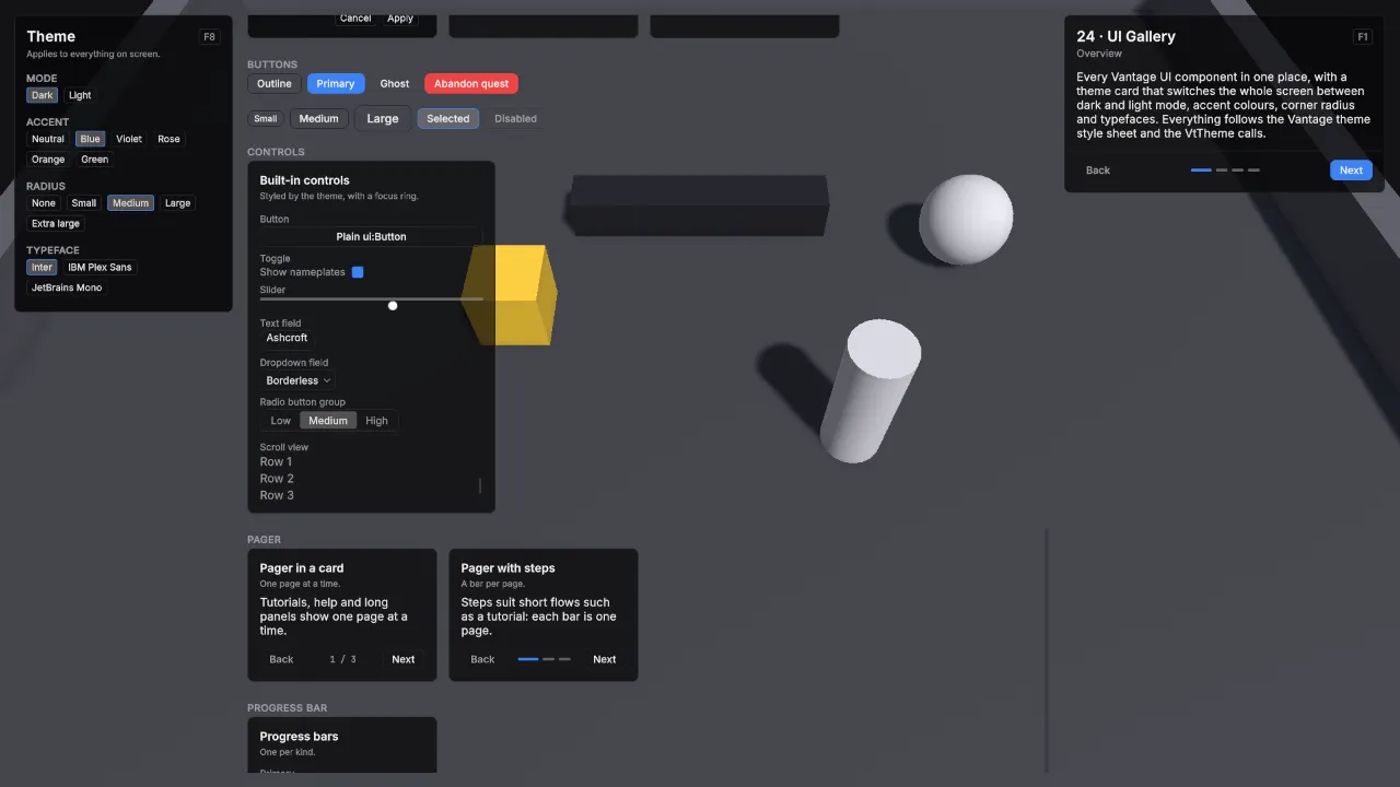
Button, Toggle, Slider, TextField, DropdownField, RadioButtonGroup and ScrollView are styled by the theme, so a plain <ui:Button> matches the Vantage components with no work:
<ui:Button text="Save" />
<ui:Toggle label="Show nameplates" />
<ui:Slider low-value="0" high-value="1" value="0.6" />
Controls are 28 px tall with a hairline border on a transparent surface. Everything focusable draws its border in --vt-primary while it has focus, so a gamepad or Tab shows where it is without anything moving, and a disabled control fades to 40%. A radio button group is drawn as a segmented control, and its checked button takes the --vt-hover fill.
The popup menu a DropdownField opens is styled too: a window surface with a hairline border, rows that highlight under the pointer and a check in front of the chosen one. One limit comes from UI Toolkit itself: the slider thumb stays inside the track instead of overhanging its ends.
Button
VtButton is a built-in Button with a variant and a size, so a panel picks the weight of an action instead of restyling it.
<VtButton text="Abandon quest" variant="Danger" size="Large" />var accept = new VtButton("Accept", OnAccept) { Variant = VtButtonVariant.Primary };
card.Footer.Add(accept);| Variant | Use |
|---|---|
| Outline | A hairline border on a transparent surface. The default. |
| Primary | Filled with --vt-primary, for the one action a panel wants you to take. |
| Ghost | No border until the pointer is over it, for dense rows and toolbars. |
| Danger | Filled with --vt-destructive, for actions that cannot be undone. |
| Size | Height |
|---|---|
| Small | 22 px |
| Medium | 28 px, the default |
| Large | 36 px |
| Part | Class |
|---|---|
| Button | vt-button, with vt-button--outline, --primary, --ghost or --danger, and vt-button--small, --medium or --large |
Badge
A small pill for a count, a state or a tag: “Elite”, “3”, “New”. Put one in a card’s header action, at the end of a list row, or next to a name.
<VtBadge key="item.rarity.elite" variant="Danger" />var count = new VtBadge(bag.Count.ToString(), VtBadgeVariant.Primary);
row.Trailing.Add(count);
count.Key = bag.Count.ToString();A badge is a VtText, so its key passes through the current language and it follows a language change on its own.
| Variant | Use |
|---|---|
| Outline | A hairline border on a transparent surface. The default, for counts and tags. |
| Primary | Filled with --vt-primary, for a state worth noticing, such as “New”. |
| Danger | --vt-destructive text in a matching border, for a warning, such as “Broken”. |
| Part | Class |
|---|---|
| Badge | vt-badge, with vt-badge--outline, --primary or --danger, on a vt-text |
Key cap
VtKbd shows a key. Give it an action and it shows the key or button bound to that action, follows rebinding, and switches between the keyboard and the gamepad as the player changes device. Give it text and it shows the text.
<VtKbd action-name="Gameplay/Ability 1" />
<VtKbd text="Tab" size="Large" />
var cap = new VtKbd { ActionName = VtInputActionNames.Cancel };
var padOnly = new VtKbd(hotkeys.GetAction(0)) { Scheme = VtKbdScheme.Gamepad };Scheme is Active, the default, which follows the device the player used last, or KeyboardMouse or Gamepad for a fixed one. VtInput.ActiveScheme is that device, and VtInput.SetActiveScheme overrides it from your own device handling. Size is Small, 16 pixels for hints next to text, or Large, 24 pixels for settings rows and prompts. An action with no binding in the scheme shown gets an empty, filled cap.
| Part | Class |
|---|---|
| Key cap | vt-kbd, with vt-kbd--small or --large, and vt-kbd--unbound when the action has no binding in that scheme |
Switching at runtime
Dark and light mode, the accent, the corner radius and the typeface switch while the game runs. Pass the UI Document’s root so every panel on it follows, including popup menus, which UI Toolkit draws outside the document:
var root = document.rootVisualElement;
VtTheme.SetMode(root, VtThemeMode.Light);
VtTheme.SetAccent(root, VtThemeAccent.Blue);
VtTheme.SetRadius(root, VtThemeRadius.Large);
VtTheme.SetTypeface(root, "vt-typeface-plex");| Option | Values |
|---|---|
| Mode | Dark, the default, and Light. Light mode draws text in the Medium weight and HUD cards at 80% opacity, so both read like dark mode over a game scene. |
| Accent | Neutral, the default and the text colour, then Blue, Violet, Rose, Orange and Green. |
| Radius | None, Small (4 px), Medium (8 px, the default), Large (12 px) and Extra Large (16 px). |
| Typeface | Inter, the default, or any typeface class your theme defines. |
A typeface is a class starting with vt-typeface- that sets the font variables. Add it to your theme style sheet with your own font files:
.vt-typeface-plex {
    --vt-font-regular: url("../Fonts/IBMPlexSans-Regular.ttf");
    --vt-font-medium: url("../Fonts/IBMPlexSans-Medium.ttf");
    --vt-font-semibold: url("../Fonts/IBMPlexSans-SemiBold.ttf");
    --vt-font-bold: url("../Fonts/IBMPlexSans-Bold.ttf");
}
See it running: the 24 · UI Gallery demo scene.
Card
The surface every panel and window sits on. Children go into its content. The header appears when you give it a title, a description or a header action, and the footer when you use it. Reading Header, TitleLabel, DescriptionLabel, HeaderAction or Footer creates that part, so an unused part costs nothing but touching one is enough to add it. HasHeader and HasFooter answer without creating anything.
<VtCard title="Quests" description="3 active" surface="Window">
    <ui:Label text="The Sunken Causeway" />
</VtCard>
var card = new VtCard { Title = "Threat", Surface = VtCardSurface.Hud };
card.HeaderAction.Add(new Label("F8"));
card.Add(row);
card.Footer.Add(closeButton);
card.TitleLabel.text = "Threat · Ogre";
if (card.HasFooter) card.Footer.Clear();| Surface | Use |
|---|---|
| Hud | Slightly see-through, for panels over the game. The default. |
| Window | Nearly opaque, for windows and menus. |
| Part | Class |
|---|---|
| Card | vt-card, with vt-card--hud or vt-card--window |
| Header | vt-card__header, holding vt-card__title-row and vt-card__description |
| Title | vt-card__title |
| Header action | vt-card__action, at the end of the title row |
| Content | vt-card__content |
| Footer | vt-card__footer |
Card text is shown as given. For localized text, put a VtText in the card, or pass the title through VtLocalization.Resolve first, see Localization.
List row
The row every list in a menu or a window is built from: a title, an optional detail line under it, and two slots for everything else — Leading in front for an icon, Trailing at the end for a key cap, a badge or a value. A caret shows while the row has focus or is selected, so a player moving through the list with a gamepad always sees where they are.
<VtListRow title="The Sunken Causeway" detail="Talk to the ferryman" />var row = new VtListRow(quest.DisplayName, quest.Summary, () => Open(quest));
row.Leading.Add(new VtIcon("scroll") { Size = VtIconSize.Large });
row.Trailing.Add(new VtBadge("New", VtBadgeVariant.Primary));
row.TitleLabel.Set("quest.progress", done, total);
VtUiStates.SetSelected(row, quest == chosen);
VtUiStates.SetDisabledLook(row, !quest.CanAccept);
list.Add(row);It is a Button, so clicked, focus and navigation work as usual, and everything inside it lets the click through to the row. The slots are created on first use, like the parts of a card: reading Leading or Trailing adds that slot, and HasLeading and HasTrailing ask without adding anything. Title and Detail are localization keys or the text itself, and TitleLabel and DetailLabel hand over the labels for a value that changes every frame. An empty detail line takes no space.
Mark the chosen row with VtUiStates.SetSelected, and a row that should look unavailable but still answer a click with VtUiStates.SetDisabledLook; SetEnabled(false) turns it off for real and fades it to 40%.
| Part | Class |
|---|---|
| Row | vt-list-row, with vt-is-selected or vt-is-disabled |
| Caret | vt-list-row__caret, shown on focus and while selected |
| Leading slot | vt-list-row__leading |
| Body | vt-list-row__body |
| Title | vt-list-row__title, a vt-text |
| Detail | vt-list-row__detail, with vt-list-row__detail--hidden when empty |
| Trailing slot | vt-list-row__trailing |
Window
The frame an in-game window sits in: inventory, quest log, character sheet, crafting. It is a card on the window surface with a close button in its header, an open and a closed state, and an optional drag handle, so every window in your game opens, closes and moves the same way.
<VtWindow name="bags" title="window.bags" draggable="true" starts-open="false">
    <ui:ScrollView />
</VtWindow>
var window = new VtWindow("window.bags") { Draggable = true };
window.Add(grid);
window.Footer.Add(new VtButton("Sort", Sort));
window.Opened += RefreshBags;
window.Closed += SaveLayout;
root.Layer(VtUiLayer.Windows).Add(window);
window.Toggle();A window starts closed. Open, Close and Toggle switch it and IsOpen reads it back; opening a window that is already open, or closing one already closed, does nothing. Opening moves focus to the first control inside, skipping the close button, so a gamepad lands somewhere useful; a window with nothing to press takes focus itself. Starts Open is for a panel that is up from the start.
Closable, the default, puts the close button in the header and lets Escape close the window. Turn it off for a window your own code owns, such as the one inside a dialog. Draggable lets the player pull the window around by its header; it stops at the edges of its parent so the header can always be grabbed again, and ResetPosition puts it back.
Title is a localization key or the text itself and follows a language change while the window is on screen. Everything else, description, header action and footer, is the card’s, see Card.
| Part | Class |
|---|---|
| Window | vt-window, on top of vt-card and vt-card--window, with vt-window--open or vt-window--closed |
| Close button | vt-window__close, a ghost VtButton in the card’s header action |
| Draggable header | vt-card__header with vt-window__header--draggable |
Tabs
A row of tabs across the top of a window: bags, character, quests. VtTabBar is the strip on its own, for a panel that swaps its content itself; VtTabView is the strip with a page under it, which is the whole of a tabbed window.
<VtTabBar name="tabs" selected-index="0" previous-key-text="Q" next-key-text="E" />var view = new VtTabView();
view.AddTab("window.bags", bagsPage);
view.AddTab("window.character", characterPage);
view.SelectionChanged += index => Refresh(index);
window.Add(view);Tabs are VtButtons, so click, focus and navigation work as usual, and their labels are localization keys or the text itself. SelectedIndex is clamped to the tabs that exist and is -1 while there are none; an index set before the tabs are added is honoured once they are, so UXML can pick the opening tab. SelectionChanged fires once per real change. Previous and Next wrap around.
The bar binds no keys of its own: set Previous Key Text and Next Key Text for fixed caps such as Q and E, or give PreviousKeyCap and NextKeyCap an input action so they follow rebinding, and call Previous and Next from your own input handling. Pages of a VtTabView come through AddTab; children added in UXML or with Add are not pages.
| Part | Class |
|---|---|
| Bar | vt-tab-bar, holding vt-tab-bar__tabs |
| Tab | vt-tab-bar__tab, the selected one also vt-tab-bar__tab--selected and vt-is-selected |
| Key caps | vt-tab-bar__key with --previous or --next, and vt-tab-bar__key--hidden when empty |
| View | vt-tab-view, holding vt-tab-view__pages |
| Page | vt-tab-view__page, hidden ones also vt-tab-view__page--hidden |
Dialog
The question a game stops to ask: “Abandon this quest?”, “Destroy Runed Blade?”, “Ready?”. A scrim darkens the screen and eats every click behind it, and a window in the middle carries a title, a message and one or two buttons. One dialog serves a whole game; call Show again for the next question.
var dialog = new VtDialog { Danger = true };
root.Layer(VtUiLayer.Overlays).Add(dialog);
dialog.Show("quest.abandon.title", "quest.abandon.body", "Abandon", "Keep", () => quests.Abandon(quest));
dialog.Closed += confirmed => { };
Show puts the question up and moves focus to the confirm button. Every text is a localization key or the text itself. An empty cancel text leaves a single button, for a notice with nothing to decide. Danger makes the confirm button red, for what cannot be undone. Confirm and Cancel take the dialog down, run the action you passed and raise Closed with true or false; Hide takes it down without answering. Escape and a click on the scrim cancel, unless Blocking is on, for a question that has to be answered with a button.
Countdown(seconds) adds a timer under the message for a ready check or a queue pop. Call Tick once a frame with the frame time; the line counts down in whole seconds and the dialog cancels itself when it runs out. Add a row for vantage.dialog.countdown to your table to word the line differently.
| Part | Class |
|---|---|
| Dialog | vt-dialog, with vt-dialog--shown or vt-dialog--hidden |
| Scrim | vt-dialog__scrim |
| Window | vt-dialog__window, a VtWindow |
| Message | vt-dialog__message |
| Countdown | vt-dialog__countdown, with vt-dialog__countdown--hidden when nothing is counting |
| Buttons | vt-dialog__cancel (hidden with vt-dialog__cancel--hidden) and vt-dialog__confirm |
Pager
Shows one page at a time with Back and Next and a page count, for tutorials, help and panels with more to say than fits at once. Children are its pages. Back and Next stop at the first and last page, and the controls hide when there is only one page.
<VtPager page-index="0" previous-text="Back" next-text="Next">
    <ui:Label text="First page" />
    <ui:Label text="Second page" />
</VtPager>
var pager = new VtPager();
pager.AddPage(overview);
pager.AddPage(details);
card.Add(pager);
card.Footer.Add(pager.Controls);
pager.NextButton.Variant = VtButtonVariant.Primary;
pager.Next();
pager.PageChanged += index => { };Back and Next are VtButtons: PreviousButton and NextButton hand them over, so the last step of a tutorial can carry a primary Next without a style sheet of your own. Move Controls into a card footer to keep them at the bottom on every page. The button texts pass through VtLocalization.Resolve, so they can be localization keys. After adding pages with Add to a pager that is already on screen, call Refresh; AddPage does that for you.
Set Indicator Style (indicator-style="Steps" in UXML) to show a bar per page instead of the count. The bar of the page shown is wider and uses the primary color, bars of earlier pages stay lit, and clicking a bar opens its page. Steps suit short flows such as a tutorial.
| Part | Class |
|---|---|
| Pager | vt-pager |
| Pages | vt-pager__pages; each page vt-pager__page, hidden ones also vt-pager__page--hidden |
| Controls | vt-pager__controls, with vt-pager__controls--hidden when there is one page and vt-pager__controls--steps for steps |
| Back, Next | vt-pager__button, with vt-pager__previous or vt-pager__next, on a VtButton |
| Page count | vt-pager__indicator |
| Steps | vt-pager__steps; each step vt-pager__step with --active or --done, holding a vt-pager__step-bar |
Progress bar
A bar filled from the left, for health, mana, experience, cast times and any amount out of a maximum. The fill slides to a new value.
<VtProgressBar value="0.6" kind="Health" />var bar = new VtProgressBar { Kind = VtProgressKind.Mana };
bar.Set(stats.GetPool(VtResourceKind.MP).Current, maxMana);Kind is Primary (the accent, the default), Health, Mana, Stamina, Experience or Cast. Value runs from 0 to 1 and is clamped.
| Part | Class |
|---|---|
| Bar, the empty track | vt-progress, with vt-progress--primary, --health, --mana, --stamina, --experience or --cast |
| Filled part | vt-progress__fill |
Slot
The square an ability, an item or a buff sits in: an icon, a key cap in the corner, a stack count, an optional caption and a cooldown sweep over everything. A hotbar, a bag grid and a buff bar are all built from it.
<VtSlot label="Fireball" key-text="1" count="3" caption="12 mana" size="Large" />var slot = new VtSlot { Size = VtSlotSize.Large };
slot.SetImage(ability.icon);
slot.KeyCap.ActionName = "Gameplay/Ability 1";
slot.Caption = "12 mana";
slot.Clicked += () => Cast(ability);
slot.SetCooldown(remaining / cooldown, remaining);
slot.Unaffordable = !CanPay(ability);
slot.Active = aiming == ability;
bar.Add(slot);Give it an icon id with Icon, or a definition’s own art with SetImage. With neither, Label is written across the square instead, so a slot reads before the art exists; the label hides again as soon as an image is set. Caption and Label are localization keys or the text itself, and Count is shown as given. Empty parts take no space.
The key cap is a VtKbd: KeyText writes a fixed key, and KeyCap.ActionName or KeyCap.Action follows the player’s bindings and device. SetCooldown(fraction, seconds) drives Sweep, the cooldown sweep over the icon, and marks the slot vt-slot--cooling while it covers anything. The slot is focusable and clickable, so Clicked, focus and gamepad navigation work as usual, and everything inside it lets the click through.
| Size | Square |
|---|---|
| Small | 32 px, for buff bars and dense grids. Hides the caption and the key cap. |
| Medium | 48 px, the default, for bags and hotbars. |
| Large | 64 px, for an action bar or a vendor window. |
| State | Look |
|---|---|
| Empty | A fainter border on no fill, for a slot holding nothing. |
| Unaffordable | Icon and label in --vt-destructive, for a cost the player cannot pay. |
| Active | A --vt-primary border, for a slot being cast or aimed. |
| Part | Class |
|---|---|
| Slot | vt-slot, with vt-slot--sm, --md or --lg, and vt-slot--empty, --unaffordable, --active or --cooling |
| Icon | vt-slot__icon, a vt-icon |
| Label | vt-slot__label, with vt-slot__label--hidden behind art or while empty |
| Key cap | vt-slot__key, a vt-kbd, with vt-slot__key--hidden while it shows no key |
| Count | vt-slot__count, with vt-slot__count--hidden while empty |
| Caption | vt-slot__caption, with vt-slot__caption--hidden while empty |
| Cooldown sweep | vt-slot__sweep |
Cooldown sweep
The dark cover over the part of a slot that is still cooling down, drawn straight onto the element, so it costs nothing to animate. A VtSlot already has one as Sweep.
<VtCooldownSweep mode="Radial" show-seconds="true" />slot.Sweep.Mode = VtSweepMode.Linear;
slot.Sweep.ShowSeconds = false;
sweep.Set(remaining / cooldown, remaining);Fraction runs from 1 at the start of the cooldown down to 0 when it is ready. Radial draws a wedge growing clockwise from 12 o’clock, the way an ability cooldown reads; Linear fills from the bottom up. Seconds is written over the cover with one decimal under ten seconds and none above, and nothing at zero. An element of your own only needs overflow: hidden, since the wedge is drawn past the corners on purpose. The cover takes its colour from the color of vt-cooldown-sweep, so a theme can lighten or tint it.
| Part | Class |
|---|---|
| Sweep | vt-cooldown-sweep, with vt-cooldown-sweep--radial or --linear |
| Seconds | vt-cooldown-sweep__seconds, with vt-cooldown-sweep__seconds--hidden while there is nothing to say |
Tooltip
The window that explains what the pointer or the focus is on: a title, a muted subtitle, label and value rows such as “Cooldown 8 s”, and free lines for a description or a requirement the player has not met. One tooltip serves the whole screen: put it on the tooltip layer, hand it to VtTooltips.Host, and every panel goes through the same element.
var tooltip = new VtTooltip();
root.Layer(VtUiLayer.Tooltip).Add(tooltip);
VtTooltips.Host = tooltip;

VtTooltips.Attach(slot, () => VtItemTooltip.Build(item, player, content));
VtTooltips.Attach(healthBar, () => BarContent(), VtTooltipPlacement.Pointer);
VtTooltips.Detach(slot);
VtTooltips.ShowNow(slot, content);
VtTooltips.ShowAtPointer(evt.position, content);
VtTooltips.Hide();
Placement decides where the tooltip goes. Element, the default, puts it under the element. Pointer puts it under the cursor and moves it along while the pointer moves over the element, which suits wide or thin elements such as bars; focus from a gamepad or the keyboard has no pointer, so it falls back to the element.
Attach puts the tooltip up after VtTooltips.DelayMs, 400 ms by default, whenever the pointer or the focus reaches the element, and takes it down when they leave, so a player on a gamepad reads the same text as a player on a mouse. The content source is asked each time the tooltip goes up, so it can read live numbers; handing back null or an empty content shows nothing. ShowNow skips the delay. Without a host every call does nothing, so a panel still works on a screen that has no tooltip.
What it draws is a VtTooltipContent, plain data with no UI types. VtItemTooltip.Build(item, viewer, content) fills one for an item: rarity and slot, every bonus, the set with the pieces worn, requirements marked when the viewer does not meet them, what using it does, value and description. VtAbilityTooltip.Build(ability, content) does the same for an ability: targeting, cost, cast, cooldown, range, area, what its effects do and description. Damage effects add “Damage 40 – 55 Fire”, heal effects “Heal 70” and buff effects “Applies Burning”. VtBuffTooltip.Build(buffState, content) builds a buff’s: the stacks, the time left, every stat and attribute it changes with penalties marked bad, what it deals or heals each tick, and the description. An ability effect of your own describes itself once you register it:
VtAbilityTooltip.RegisterEffect<MyKnockbackEffect>((effect, tip) => tip.Row("Knockback", effect.distance + " m"));The words they print, “Cooldown”, “Requires level 5” and so on, are localization keys on VtUiText.Keys. Their English is built in, so they read as words without a table, and a table row replaces them; see Localization.
var content = new VtTooltipContent { Title = "item.blade", Subtitle = "Epic" };
content.Row("Damage", "12 – 18");
content.Line("Requires level 20", VtTooltipLineKind.Bad);
Kind colours a value or a line: Normal in the text colour, Muted in the secondary colour, Good in --vt-friendly and Bad in --vt-destructive. Titles, subtitles, row labels and lines are localization keys or the text itself; row values are shown as given in the monospaced face, so numbers line up. ShowAt(anchor, content) places the tooltip yourself: under the anchor, flipping above when there is no room and sliding left at the right edge. Nothing in it takes the pointer.
| Part | Class |
|---|---|
| Tooltip | vt-tooltip, with vt-tooltip--shown while up and vt-tooltip--measuring for the frame before it is placed |
| Sections | vt-tooltip__header holding the title and subtitle, then the rows, then the lines, each with vt-tooltip__section--empty while it has nothing to show; the rows and the lines draw a divider above them, which vt-tooltip__section--first drops when nothing is shown above |
| Title, subtitle | vt-tooltip__title, vt-tooltip__subtitle, each with --hidden while empty |
| Rows | vt-tooltip__rows; each row vt-tooltip__row, holding vt-tooltip__row-label and vt-tooltip__row-value with vt-tooltip__value--good, --bad or --muted |
| Lines | vt-tooltip__lines; each line vt-tooltip__line, with vt-tooltip__line--good, --bad or --muted |
Drag and drop
Moving what a slot holds into another slot: an item out of a bag onto the action bar, two abilities swapped, or a bar slot cleared by dropping it on nothing. Both ways in are covered, a drag with the pointer or a pick-up and place with a gamepad or the keyboard, and both end the same way, so a panel only listens to Dropped and DraggedOut.
<VtSlot drag-source="true" drop-target="true" />bagSlot.Payload = item;
bagSlot.DragSource = true;
barSlot.DropTarget = true;
barSlot.Dropped += (from, payload) => Assign(barSlot, payload);
barSlot.DraggedOut += slot => Clear(slot);Payload is whatever your panel understands, an item or an ability definition, and arrives on the target as the second argument of Dropped together with the slot it came from, so a swap has everything it needs. A slot that holds nothing cannot be dragged. DraggedOut fires on the source when the drag ended over no target at all.
With the pointer, a press that moves more than 4 px turns into a drag: a ghost of the icon follows the pointer and the slot under it lights up. The press that became a drag is not a click. With a gamepad or the keyboard, Submit on a source picks its payload up, Submit on a target places it, and Submit on the picked-up slot again puts it back. VtDragDrop.PickUp, Place and CancelPickUp do the same from code.
| State | Class |
|---|---|
| The slot a drag started from | vt-slot--dragging, faded |
| The slot the ghost is over | vt-slot--drop-hover, a --vt-primary border |
| The slot picked up with a gamepad | vt-slot--picked, a --vt-primary border |
| The ghost following the pointer | vt-drag-ghost, on the panel root |
Toasts
A stack of short messages that time out: “Not enough gold”, “Quest complete”. VtToastHost is the stack; the sample’s VtToasts panel puts one on the screen and ticks it for you.
<VtToastHost max-visible="4" />var toasts = new VtToastHost { MaxVisible = 4 };
overlays.Add(toasts);
toasts.Show("Not enough gold", VtToastSeverity.Error);
toasts.Show("quest.complete", "The Sunken Causeway", VtToastSeverity.Success, 5f);
void Update() => toasts.Tick(Time.unscaledDeltaTime);The newest message is at the bottom. Each toast fades out when its seconds are up; showing one more than MaxVisible drops the oldest at once. Count says how many are up and Clear takes them all down. Nothing in the stack takes the pointer.
A toast is a card with the severity’s icon in the severity’s colour, a title and, under it, an optional detail line in the secondary colour: “Quest complete” over “The Sunken Causeway”. Title and detail are VtText, so each is a localization key or the text itself and follows a language change while the toast is up. Leave the detail empty for a one-line toast.
| Severity | Icon | Icon colour |
|---|---|---|
| Info | info | --vt-info. The default. |
| Success | circle-check | --vt-success. |
| Warning | triangle-alert | --vt-warning. |
| Error | circle-x | --vt-destructive. |
| Part | Class |
|---|---|
| Stack | vt-toasts |
| Toast | vt-toast, with vt-toast--info, --success, --warning or --error, and vt-toast--leaving while it fades and drops |
| Icon | vt-toast__icon, a vt-icon |
| Title and detail | vt-toast__content holding vt-toast__title and vt-toast__detail, which takes --hidden while empty; both are vt-text |
Building a HUD
Vantage ships what a HUD is built from, not a finished HUD: the layers and navigation above, the components and theme, two base classes and a presenter per system. Every game draws its own panels. The Demos sample has a complete set to start from, see Sample HUD panels.
VtHudPanel is the base for a panel on the HUD. Derive from it, make its element in Build and draw in Refresh, which runs every frame while it is shown. It gives every panel a Region (a corner or edge of the HUD) and an Order within it, PlaceIn(element) to put it inside an element of your own layout instead, Hidden and Toggle(), and a Layout field: the panel clones a UXML file and finds its parts by name, so a designer rearranges it in UI Builder. With Layout empty it loads the file named by DefaultLayout from any Resources/VtLayouts folder through VtUiLayouts. RefreshNow() draws it at once instead of on the next frame.
VtWindowPanel is the base for a window the player opens. Derive from it, fill the window in BuildContent and draw in Refresh. It sits in a VtWindow on the Windows layer, opens and closes through the navigation stack (Open, Close, Toggle), so Esc closes it and game input waits while it is up, and has Title, Layer, Draggable and Starts Open.
Presenters read a unit into plain state objects with no UI types, so your panel only draws. Each one has a page with the system it reads.
| Presenter | Reads |
|---|---|
VtUnitFramePresenter, VtResourceBarPresenter, VtXpPresenter |
Name, level, relation, pools, experience, the cast in progress. |
VtActionBarPresenter |
The slots of VtAbilityHotkeys with cooldowns and cost. A bar that also holds items and buildables reads a hotbar. |
VtStatListPresenter |
Stat and attribute rows, formatted. |
VtInventoryPresenter, VtEquipmentPresenter |
The bag, the gear, durability and set bonuses. |
VtQuestLogPresenter, VtDialoguePresenter |
Quests with objectives; the conversation and its answers. |
VtCraftingPresenter, VtTalentPresenter, VtBuildPresenter |
Recipes, talents and buildables with why each cannot be used and what they cost. See Building for the build menu. |
VtSelectionPresenter, VtThreatPresenter, VtInteractionPresenter |
The selection, a threat table, what the player can interact with. |
VtMinimapPresenter |
The map area, unit dots and quest pins; VtMapArea and VtMapMarker author them. |
The words the panels print are localization keys with English defaults, on VtHudText.Keys, VtInventoryText.Keys, VtQuestUiText.Keys, VtCraftingText.Keys, VtBuildText.Keys, VtTalentText.Keys and VtSelectionThreatText.Keys, and refusal reasons come from VtFailureText. Tooltips come from VtAbilityTooltip, VtItemTooltip and VtBuffTooltip.