Sample HUD panels
The Demos sample includes a full set of finished HUD panels and windows: unit frames, bars, an action bar, toasts, the inventory, quest, dialogue, crafting and talent windows, a minimap and nameplates. The demo scenes use them. They are yours to copy and change: after importing the sample (see Demos), copy Scripts/Panels, Kit/UI/Panels and Resources/VtLayouts into your project, or use them straight from the sample folder.
The package itself ships what these panels are built from, and what you build your own panels from: the screen layers, navigation, the VtHudPanel and VtWindowPanel base classes, the presenters that read game state, and the components and theme. See UI. VtMapArea, VtMapMarker, the VtNameplate element and every presenter mentioned on this page are part of the package.
To use the panels’ look, import the sample’s Kit/UI/Panels style sheets into your theme after the package theme, as Kit/UI/VtDemoTheme.tss does.
HUD panels
The panels a game needs to be playable, each a component next to the VtUiRoot: add it, point it at a unit, pick a region. Every panel sits in a corner or edge of the HUD (Region), stacked from the top of the region down by Order, lowest first, or inside an element of your own layout when you call PlaceIn(element), can be hidden and shown (Hidden, Toggle()), and is built from the components above, so your theme restyles it. Pool colours follow the pool: health, mana, and the stamina colour for stamina, energy, focus and rage.
| Component | Shows | Fields |
|---|---|---|
| VtUnitFrame | Portrait, name, level, type icon, a bar per resource pool and the active buffs, each where its layout has a part for it. The name, and the portrait’s border, take the colour of the shown unit’s relation to the frame’s unit: hostile, neutral or friendly. | Unit; Source Unit or Target Of Unit, which follows what the unit selects or fights and hides the frame when there is nothing; Show Level, Show Icon; Portrait Source and Portrait Studio, see Portraits; Health Only, Show Pool Labels, Show Pool Values; Show Buffs, Max Buffs; Layout and Pool Layout, see below. |
| VtBuffBar | The active buffs as small slots with the icon, from the buff’s Icon sprite or else its Icon Id in the icon set, or else the first letters of the name, the stacks and a sweep counting the time left. A buff with Harmful on, a debuff, gets a red border and its tooltip reads Debuff. Hovering a slot shows the buff’s tooltip. Hides while there are none. | Unit; Source; Slot Size; Max Visible, 0 for every one; Show Tooltip, on by default; Layout. |
| VtActionBar | One slot per hotkey with the ability’s icon, from its Icon sprite or else its Icon Id in the icon set, or else its name, its key, the cooldown and global cooldown as a sweep with the seconds left, a red icon while the unit cannot pay for it, and a highlight while aiming. Clicking a slot presses it. | Hotkeys, empty for the ones on the same object; Slot Size for the slots it makes; Show Caption for the cost under each slot, or the cast time for a free ability; Show Seconds; Show Tooltip, on by default, for the ability’s tooltip on hover; Layout, see below. |
| VtResourceBar | One bar: a pool with its name and “70 / 100” in the pool’s colour, the experience as “Level 5” and “120 / 300” or “Max level”, or the cast in progress as “Casting Heal” and “1.5s” in the cast colour, which makes it the cast bar. Hides while there is nothing to show. | Unit; Source Unit or Target Of Unit; Bar Source Pool, Experience or Cast; Pool; Show Label, Show Value; Show Tooltip, on by default: hovering the bar shows the label and the numbers, so a layout without numbers can still be read, and the bar takes the pointer; Tooltip Placement, Pointer by default so the tooltip sits at the cursor and follows it, or Element for under the bar; Layout, see below. |
| VtStatList | A card of stats and attributes, one row each; a value flashes green or red for a moment when it changes. | Unit, Title, Rows: label, stat or attribute, and the format Flat, Flat As Percent or Bonus Percent. |
| VtToasts | Short messages stacked in a corner or edge of the screen that fade after Seconds. Show(title, severity) or Show(title, detail, severity) from anywhere. |
Position, Top Right by default; Seconds. |
| VtUiNotifications | Turns the player’s events into toasts: a refused cast with its reason, a level gained, quests accepted, completed, turned in or failed, crafts finished or refused, talents learned, items broken and currency gained or spent. | Player; Toasts, empty for the ones on the same object; Cast Failures; Currency. |
var frame = hud.AddComponent<VtUnitFrame>();
frame.Unit = player;
frame.Region = VtUiRegion.TopLeft;

var target = hud.AddComponent<VtUnitFrame>();
target.Unit = player;
target.Source = VtUnitSourceKind.TargetOfUnit;

var health = hud.AddComponent<VtResourceBar>();
health.Unit = player;
health.Pool = VtResourceKind.HP;

var xp = hud.AddComponent<VtResourceBar>();
xp.Unit = player;
xp.BarSource = VtBarSource.Experience;

var buffs = hud.AddComponent<VtBuffBar>();
buffs.Unit = player;
buffs.Region = VtUiRegion.TopRight;

var cast = hud.AddComponent<VtResourceBar>();
cast.Unit = player;
cast.BarSource = VtBarSource.Cast;
cast.Region = VtUiRegion.BottomCenter;

VtToasts.Current.Show("Saved", VtToastSeverity.Success);
The frame, the buffs and the cast are separate panels so each sits where your game wants it: bars over the hotbar with the buffs top right, or a frame top left with everything beside it. Point all three at the player with Source set to Target Of Unit for the target’s frame, buffs and cast.
Each notification is a toast with a short title and a detail: “Level up” over “You reached level 5”, “Quest complete” over the quest’s name, a refusal reason such as “Out of range” over the ability’s name. Every line is a localization key with an English default, listed on VtUiNotifications.Keys, and refusal reasons use the keys of VtFailureText: add rows for vantage.notify.levelUp reading Stufe erreicht and vantage.notify.levelUpDetail reading Du hast Stufe {0} erreicht to your table and level-ups show in German. The words the bars print, “Level 5”, “Max level”, “Health”, “Casting Heal”, “70 / 100”, are keys on VtHudText.Keys in the same way.
The reading side is separate from the drawing side, so a panel of your own can reuse it: VtUnitFramePresenter fills a VtUnitFrameState with everything the frame shows, VtActionBarPresenter lists the slots with their cooldowns (a bar that holds items and buildables as well reads a hotbar instead), VtStatListPresenter reads and formats rows, VtResourceBarPresenter reads one pool, the experience or the cast into a VtResourceBarState with its label, numbers, fill and colour, and VtXpPresenter reads a level. None of them touch UI Toolkit.
| Part | Class |
|---|---|
| Unit frame | vt-unit-frame on a card, with --dead, --hostile, --friendly or --neutral, and --target in the target layout; __portrait, with --empty while it shows __initials; vt-unit-frame__header holding __name, __icon and __level, or in the target layout __name and __icon, with the level as __level--portrait on the portrait’s corner inside __portrait-frame; __pools holding a __pool per pool, also __pool--hp, __pool--mp and so on, each a resource bar with its own classes; __buffs holding a __buff slot each |
| Buff bar | vt-buff-bar, with vt-buff-bar__buffs holding a __buff slot each; a debuff’s slot also has vt-buff--harmful, in the unit frame too |
| Action bar | vt-action-bar on the root, vt-action-bar__slots on the row the made slots go into, and vt-action-bar__slot on every slot, made or placed |
| Resource bar | vt-resource-bar on the root, --compact in the compact layout and --thin in the thin one; __header, __label, __value, __bar, and __track around the bar in the compact layout |
| Stat list | vt-stat-list on a card, with a __row per row holding __label and __value, which takes --up or --down while it flashes |
| Toasts | vt-toasts--screen on the host, with vt-toasts--top-right, --top-center, --top-left, --bottom-right, --bottom-center or --bottom-left for its position |
Your own layout
A panel that draws from a layout clones a UXML file and finds its parts by name, so you rearrange it in UI Builder instead of code. The sample’s files are under Resources/VtLayouts in the Demos sample: duplicate one into your project, open it in UI Builder, move the parts around, delete the ones you do not want, and set the copy on the panel’s Layout field. The panel finds the parts it knows by their names and skips the ones your file lacks; anything else in your file is yours. Leaving Layout empty uses the file of the panel’s name from any Resources/VtLayouts folder.
| Panel | Sample layouts | Parts |
|---|---|---|
| Resource bar | VtResourceBar, the label and numbers over the bar; VtResourceBarCompact, the numbers on the bar; VtResourceBarThin, a slim bar with no label and no numbers, made for experience, with the tooltip saying the rest |
label, a Label; value, a Label; bar, a VtProgressBar |
| Unit frame | VtUnitFrame, a card with the name and level over the pools; VtUnitFrameTarget, for a selected unit: a portrait with the level in a round badge on its corner, beside the name, type icon, pools and a row of buffs |
portrait, an element the picture fills and the initials are written in; name, a Label; level, a Label; icon, a VtIcon; pools, the element the pool rows go into, each a clone of Pool Layout with the resource bar’s parts; buffs, the element the buff slots go into |
| Buff bar | VtBuffBar, a wrapping row |
buffs, the element the slots go into; a column is its flex direction |
| Action bar | VtActionBar, a row |
slot-1, slot-2 and so on, a VtSlot each, used for that hotkey wherever it sits and at its own size; slots, the element a slot is made in for every hotkey without one. A hotkey with neither is not drawn |
xp.Layout = compactLayout;
frame.PoolLayout = compactLayout;
Every part is a plain UI Toolkit type or one of the components above, so a VtText where the table says Label keeps localization, and a VtProgressBar keeps its colour kinds.
Portraits
A unit frame with a portrait part draws the shown unit’s picture. Portrait Source decides where it comes from:
| Portrait Source | Picture |
|---|---|
| Auto, the default | The unit definition’s Portrait sprite; without one, the unit’s model rendered by a portrait studio; without a studio or a model, the unit’s initials. |
| Image | The Portrait sprite, or the initials. |
| Model | The rendered model, or the initials. |
| Initials | The initials, such as “EW” for Ember Wraith. |
VtPortraitStudio renders the model. Add it to a GameObject with a Camera and leave it in the scene; set it on the frame’s Portrait Studio, or leave that empty to use the one in the scene. Its camera frames the top of the unit, head and shoulders by default, from in front and a little to the side, follows the unit while it moves, and renders into a texture with a transparent background. Framed Height sets how much of the model is in the shot, Angle how far round the camera stands, Resolution the texture size. One studio renders one unit, so give each frame that shows a model its own studio, and keep other models out of the shot or out of the camera’s culling mask.
frame.PortraitTexture is the picture the frame is showing: the sprite’s texture, the studio’s render texture, or null while it shows initials. Use it to draw the same portrait in a uGUI RawImage.
The unit definition’s Icon Id names an icon from the icon set, such as skull or shield, that the frame shows next to the name to mark what kind of unit it is.
var target = hud.AddComponent<VtUnitFrame>();
target.Unit = player;
target.Source = VtUnitSourceKind.TargetOfUnit;
target.Layout = targetLayout;
target.HealthOnly = true;
target.PortraitStudio = studio;
See it running: every demo scene from 01 · Hello Unit on uses these panels.
Windows for the player
The windows a game needs, each a component next to the VtUiRoot that opens through the navigation stack: bind a key or a button to its Toggle(). Every window has Title (a key or text; empty uses the window’s own), Layer, Draggable and Starts Open, and can be placed in an element of your own with PlaceIn. On a layer a window is at most 90% of the screen tall and its content clips; placed in your element it carries vt-window--placed and takes the height its content needs, so give the element a height and overflow: hidden if it has to fit somewhere.
Inventory and equipment
The player’s bag and their gear in one window, on two tabs. Add VtInventoryWindow next to the root and point it at a unit.
Bags is a grid of every slot the bag can hold, in position, area by area under each area’s name when the bag has several, each with the item’s icon, or its name while there is no art, the stack count, a thin wear bar along the bottom for items that wear out, and the item’s tooltip. Clicking a slot uses the item when it has a use, otherwise puts it on; an item that goes on leaves the bag, and whatever it replaced takes its slot. Dragging a slot onto another moves the stack there, adds it to the same item, or swaps the two. Above the grid is the count of entries used, below it the wallet, one coin line per currency.
Equipment is one row per slot: the square, the slot’s name, the item worn or “Empty”, and a durability bar with its numbers for items that wear out. Clicking a row takes the item off; dragging an item from the bag onto a row puts it in that slot, dragging a worn item out takes it off, and dragging a row onto a bag slot takes the item off into that slot. Under the rows are the set bonuses in play, each tier lit when enough pieces are worn. Everything goes through VtUnitInventory, VtUnitEquipment and VtUnitWallet, so a refused equip, unequip or use changes nothing and shows the reason as a toast; a backpack in the Back slot will not come off while the bag would overflow without it.
| Field | Shows |
|---|---|
| Unit | The unit whose bag and gear the window shows. |
| Columns | How many slots fit on a row before the grid wraps. Six by default. |
| Slot Size | How big the bag slots are. |
var bags = hud.AddComponent<VtInventoryWindow>();
bags.Unit = player;
bags.Toggle();| Part | Class |
|---|---|
| Bags page | vt-inventory, with vt-inventory__header, vt-inventory__grid of vt-inventory__slot squares with a vt-inventory__slot-wear bar and vt-inventory__area names, and vt-inventory__wallet of vt-inventory__currency lines |
| Equipment page | vt-equipment, one vt-equipment__slot row per slot holding a vt-slot, vt-equipment__slot-name, vt-equipment__item and a vt-equipment__durability bar with vt-equipment__durability-value |
| Set bonuses | vt-equipment__sets; each vt-equipment__set with its vt-equipment__tier lines, --active when reached |
The words the window prints on its own, “Inventory”, “Bags”, “Equipment” and “Empty”, are localization keys with English defaults on VtInventoryText.Keys.
Currency readout
VtCurrencyReadout puts the player’s money on the HUD: a small card with one row per currency in the unit’s wallet, each a coin, the balance and the currency’s name. It follows the wallet and hides while the unit has none. Fields: Unit and Region.
| Part | Class |
|---|---|
| Card | vt-currency, one vt-currency__row per currency holding a vt-icon, vt-currency__amount and vt-currency__name |
Quest log and tracker
Two panels cover the player’s quests; point each at the player and it reads the unit’s VtUnitQuestLog on its own.
| Component | Shows | Fields |
|---|---|---|
| VtQuestLogWindow | A window with three tabs, Active, Completed and Failed, listing each quest with its objectives and their counts, the time left on a timed quest and the countdown of a repeatable one. A badge in the header counts the active quests. Picking an active quest offers to abandon it behind a confirmation. | Unit, plus the window fields. |
| VtQuestTracker | The quests worth watching in a corner of the HUD: the ones waiting to be handed in first, then the ones in progress, each with its name, objective lines and a timer when timed. Hides while there is nothing to track. | Unit, Max Quests (3), Region (Top Right). |
var log = hud.AddComponent<VtQuestLogWindow>();
log.Unit = player;
var tracker = hud.AddComponent<VtQuestTracker>();
tracker.Unit = player;
VtQuestTracker.TurnInTarget = quest => quest == wolves ? "Brennan" : null;
A finished quest reads “Complete” on the tracker; VtQuestTracker.TurnInTarget names the NPC it goes back to and it reads “Return to Brennan” instead. VtQuestLogPresenter fills a VtQuestLogState with the quests grouped and their objectives in one shared list, with no UI types. Every word the panels print themselves is a localization key with an English default on VtQuestUiText.Keys.
| Part | Class |
|---|---|
| Quest log | vt-quest-log on the window, with __count, __page per tab, __empty and __abandon |
| One quest | vt-quest, holding vt-quest__row with a __category tint bar, __objectives with an __objective per line that takes --done, plus __timer and __cooldown |
| Quest tracker | vt-quest-tracker on a card, with a __quest each holding __name, an __objective per line with --done, and __timer |
Dialogue window
VtDialogueWindow draws the conversation the player is having: the speaker, their line, and the answers as numbered rows. An answer that takes a quest is marked “Quest” and one that hands a quest back “Turn in”; a locked answer is greyed out. The window opens itself when a conversation starts and closes when it ends, and closing it ends the conversation. The number keys 1 to 9 pick an answer while it is open. A line with no answers gets a Continue row, and the last line an End row.
- Add Component → Vantage → UI → VtDialogueWindow on the object with the root.
- Set Unit to the player, the unit with the
VtUnitDialogue.
var conversation = hud.AddComponent<VtDialogueWindow>();
conversation.Unit = player;
conversation.Choose(0);
VtDialoguePresenter reads the same thing into a VtDialogueState for a window of your own.
| Part | Class |
|---|---|
| Conversation | vt-dialogue on the window, with __speaker, __line, __answers holding a __answer each with its __answer-badge, and __continue and __end rows |
Crafting window
VtCraftingWindow lists a unit’s crafting skills with their level and an experience bar, every recipe with its output, its ingredients as “3 Iron Ore · 1 Coal”, short ones written “1/3 Iron Ore”, and a badge reading Craft or why it cannot be crafted, the craft in progress with its bar, and the station the unit stands at. It opens through Toggle() like any window, or by itself when the unit walks up to a crafting station, and closes when the unit leaves it. Clicking a recipe crafts it at the nearest station of the type it needs; a refused craft toasts the reason in the player’s words, and a recipe that cannot be crafted looks unavailable but still answers a click so the player gets told why. Recipes the unit’s recipe book has learned are listed after the ones you configure.
| Field | What it does |
|---|---|
| Unit | The crafter. |
| Recipes | The recipes the window always lists, known or not. |
| Open At Station | Open when the unit reaches a station. On by default. |
var crafting = hud.AddComponent<VtCraftingWindow>();
crafting.Unit = player;
crafting.Recipes = new[] { ironSword, ironHelm };| Part | Class |
|---|---|
| Crafting window | vt-crafting on the window, with a __section per heading; __skills holding a __skill each with __skill-header, __skill-name, __skill-level, __skill-value and __skill-bar; __recipes holding a __recipe row each with a __recipe-badge; __craft with --hidden, __craft-label and __craft-bar; __station |
Talent window
VtTalentWindow shows a unit’s level, the points it has left, the attributes it may raise and the talents of its tree: “Level 5” and “3 talent points · 2 attribute points”, a row per attribute with its total and a + button that spends a point, and a row per talent with its name, what it needs (“Level 3 · Heavy Blows 2”) and a rank badge such as “1/3”. A tooltip describes the talent, or the ability it grants. Clicking a talent learns its next rank; both learn and spend toast the reason when they refuse. The Reset button in the footer asks for a confirmation and then refunds every rank and point. The unit needs a VtUnitProgression; its tree decides what the window lists. Field: Unit.
var talents = hud.AddComponent<VtTalentWindow>();
talents.Unit = player;| Part | Class |
|---|---|
| Talent window | vt-talents on the window, with __level, __points, a __section per heading, __attributes holding an __attribute each with __attribute-name, __attribute-value and __attribute-spend, __talents holding a __talent row each with a __talent-rank badge, and __reset in the footer |
Both windows print their own words through localization keys with English defaults on VtCraftingText.Keys and VtTalentText.Keys, and VtCraftingPresenter and VtTalentPresenter fill plain state objects for windows of your own. For a build menu, VtBuildPresenter reads the categories, pieces, reasons and costs; see Building.
Selection panel
VtSelectionPanel is the readout of what the player has selected: a heading with the count or the single unit’s name, a tile per unit with its health under it, and a badge per control group that holds units. Clicking a tile selects only that unit; clicking a group badge calls the group back, as its number key does. The panel hides while nothing is selected and no group holds anything. Units have no portrait art of their own, so a tile shows the first letters of the unit’s name; IconProvider hands portraits over.
| Field | Default | What it does |
|---|---|---|
| Selection | None | The selection to draw. Empty: the one on this object. |
| Control Groups | None | The groups to badge. Empty: the ones next to the selection. |
| Max Tiles | 12 | Most tiles drawn at once; the rest are counted in a badge next to the heading. |
| Region | Bottom Left | Where the panel sits. |
var panel = hud.AddComponent<VtSelectionPanel>();
panel.Selection = player.GetComponent<VtUnitSelection>();
panel.IconProvider = unit => portraits.For(unit.Definition);| Part | Class |
|---|---|
| Selection panel | vt-selection on a card, with __tiles holding a __tile per unit, which takes vt-is-selected on the primary, each with a __icon slot and a __health bar; __more on the overflow badge; __groups holding a __group badge each |
Threat list
VtThreatList shows the threat table of the unit the player is looking at, highest first: one row per attacker with its name, a bar of its share of the top threat and the value. The player’s own row is picked out, so a tank reads at a glance whether it still holds aggro. The list follows what the player has selected, or else what it is fighting, and hides while neither keeps a threat table. Fields: Unit (the viewer), Max Rows (5), Region (Top Right).
| Part | Class |
|---|---|
| Threat list | vt-threat on a card, with a __row per attacker, --self on the viewer’s own, holding __name, __bar and __value |
Interaction prompt
VtInteractionPrompt is the “Talk to Ilse” line that appears when the player walks up to something it can interact with: a quest giver, a vendor, a crafting station, a dropped item or a resource node. It shows a key cap and the line, and hides once nothing is in reach. The prompt only says what is there; interacting is still a right-click on the thing itself.
| Field | Default | What it does |
|---|---|---|
| Player | None | The player the prompt is for. Empty: the unit on this object. |
| Range | 3 | Metres the prompt reaches. A thing with a larger interact radius of its own prompts from there. |
| Rescan Seconds | 0.25 | How often interactables that spawned or went away are picked up. |
| Action Name | empty | An input action for the key cap, such as Gameplay/Interact; the cap then follows rebinding and the player’s device. |
| Key Text | F | What the cap shows without an action. |
| Region | Bottom Center | Where the prompt sits. |
var prompt = hud.AddComponent<VtInteractionPrompt>();
prompt.Player = player;
prompt.Presenter.Candidates = () => myLevers;
prompt.Presenter.VerbProvider = target => "myGame.ui.pull";| Part | Class |
|---|---|
| Interaction prompt | vt-interaction on a card, with __key and __line |
Every word these three panels print is a localization key with an English default on VtSelectionThreatText.Keys, and VtSelectionPresenter, VtThreatPresenter and VtInteractionPresenter fill plain state objects with no UI types.
Minimap
VtMinimap is a north-up map of the ground around the player. It shows:
- the picture of the map area the player stands in, with the fog of war over it when the scene has a
VtFogOfWar - an arrow for the player, turned the way the player faces
- a dot for each unit around the player: hostile, friendly or neutral. Hostile and neutral units show only while in sight.
- a mark over quest givers: one when they have a quest the player can take, another when a finished quest waits to be handed in
- a pin on the places and people the player’s active quests send it to: reach-location markers and talk targets. Out of range, the pin stays on the rim and points the way.
- every
VtMapMarkerin the scene
Under the map are the area’s name and two zoom buttons.
- Add Component → Vantage → UI → VtMapArea on an empty object in the middle of your map. Set Size to the ground it covers and Display Name to its name.
- Press Capture Image on the area. It renders the scene from straight above, units left out, into a PNG next to the scene and sets it as Image. You can also paint your own picture, north up, and set that instead.
- Add Component → Vantage → UI → VtMinimap next to the
VtUiRootand set Unit to the player.
Without a map area, the map draws its plain background with the markers on it. Areas may sit inside each other, such as a village inside a valley; the minimap uses the smallest one holding the player. For generated worlds, call area.Capture() at runtime and set the texture as area.Image.
| Field | Default | What it does |
|---|---|---|
| Unit | None | The unit the map is centred on. |
| Shape | Round | Round, or Square with the theme’s corner radius. |
| Diameter | 180 | Width and height of the map in pixels. |
| Radius | 30 | Metres from the centre to the edge. |
| Min Radius, Max Radius | 10, 90 | The closest and the farthest zoom. |
| Zoom Step | 1.5 | How much one press of a zoom button changes the range. |
| Show Zoom Buttons, Show Area Name, Show Fog | on | Parts of the map to draw. |
| Filter | all on | Hostile, friendly and neutral units, quest markers and scene markers. |
| Rescan Seconds | 0.25 | How often units, quests and markers are read again; positions follow every frame. |
| Region | Top Right | Where the map sits. |
VtMapMarker puts an icon from the icon set on the map: a vendor, a dungeon entrance, a waypoint. On a unit it replaces the unit’s dot. Tint picks the colour. Reveal decides when it shows through the fog: Always, When Explored or When Visible. Pin To Edge keeps it on the rim while out of range.
var map = hud.AddComponent<VtMinimap>();
map.Unit = player;
map.Clicked += point => player.GetComponent<VtTopDownClickToMove>().MoveTo(point);

var shop = vendor.AddComponent<VtMapMarker>();
shop.Icon = "store";
shop.Tint = VtMapMarkerTint.Primary;
Clicked fires with the world point under the pointer, for a move order or a ping. ZoomIn(), ZoomOut() and Radius zoom from code. VtMinimapPresenter reads the area and the markers into a VtMinimapState with no UI types; VtMinimapRules holds the arithmetic for a map of your own. VtFogOfWar.OverlayTexture is the fog as a black texture whose alpha is the fog, over VtFogOfWar.WorldRect.
| Part | Class |
|---|---|
| Minimap | vt-minimap on a card, with --round or --square; __viewport clipping __picture, __fog and __markers; __bar holding __area and two __zoom buttons |
| Marker | vt-minimap__marker, with --self, --hostile, --friendly, --neutral, --quest-available, --quest-turn-in, --quest-target or --custom, a --tint-* class for the marker’s tint, and --pinned while held on the rim; a unit’s dot is vt-minimap__dot, every other marker a vt-icon |
Quest markers take the --vt-quest colour.
Nameplates
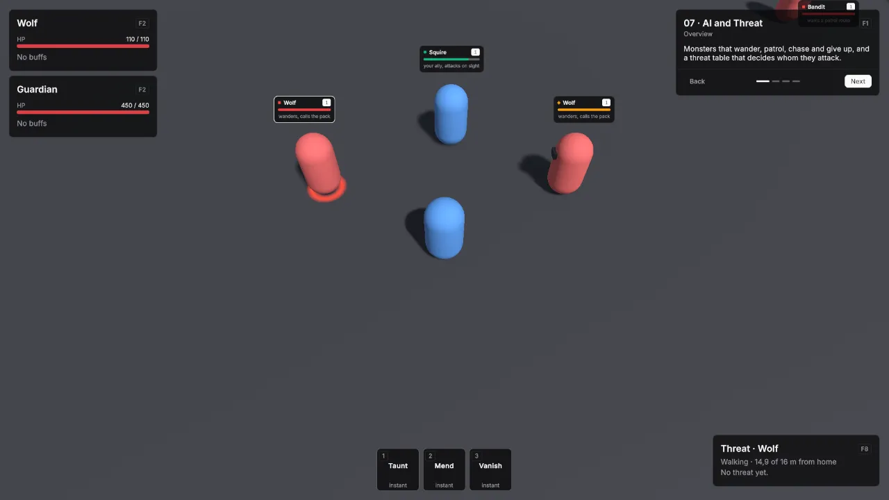
VtNameplates draws a plate over the head of every unit with health: its name, level, a health bar and an optional subtitle. The bar is red for hostile units, green for friendly ones, amber for neutral ones and the accent colour for the viewer. A small marker in front of the name repeats the relation as a shape — a square for hostile, a circle for friendly, a diamond for neutral, and none for the viewer — so players who do not separate those colours still read the plate at a glance. Plates hide while a unit is dead, off screen or too far away, stay whole at the screen edge, and get an accent border on the viewer’s selection or target.
- Select the object with your HUD’s UI Document and Add Component → Vantage → UI → VtNameplates.
- Set Viewer to the player’s unit.
The plates sit on the World layer when a VtUiRoot is on the same object, otherwise under everything else on that document, and ignore the pointer, so clicks still reach the units. Units that spawn later get a plate within a quarter of a second.
| Field | Default | What it does |
|---|---|---|
| Viewer | None | The unit the plates are seen from. It decides hostile, friendly and neutral, and its selection or target is highlighted. Empty: seen by the Player faction. |
| View Camera | None | The camera the plates follow. Empty: the main camera. |
| Filter | Hostile and Friendly on | Which units get a plate: Hostile, Friendly, Neutral and Self, the viewer itself. Visibility is Always, or When Damaged Or Targeted for plates only on hurt units and the viewer’s target. |
| Show Level | On | The level badge next to the name. |
| Height Offset | 0.5 | Metres between the top of the unit’s collider and the bottom of its plate. |
| Max Distance | 60 | Units farther from the camera get no plate. 0 means no limit. |
| Rescan Seconds | 0.25 | How often new and removed units are picked up and subtitles refreshed. |
Add VtNameplateInfo to a unit to give its plate a Subtitle, such as a title or a hint, or to switch Hidden on for no plate. The subtitle can be a localization key. For subtitles built from game state, such as a quest marker or active effects, set a provider; it runs for each plate on screen at every rescan:
nameplates.SubtitleProvider = unit =>
{
    string subtitle = VtNameplates.DefaultSubtitle(unit);
    return unit.IsInvulnerable ? subtitle + " · invulnerable" : subtitle;
};
The plate itself is VtNameplate, which you can also place on its own:
<VtNameplate unit-name="Bandit" level="7" health="0.6" relation="Hostile" subtitle="Camp leader" />| Part | Class |
|---|---|
| Plate | vt-nameplate, with vt-nameplate--hostile, --friendly, --neutral or --self, and vt-nameplate--targeted |
| Name and level row | vt-nameplate__header |
| Relation marker | vt-nameplate__mark, shaped and coloured by the relation class on the plate |
| Name | vt-nameplate__name |
| Level badge | vt-nameplate__level, with vt-nameplate__level--hidden without a level |
| Health bar | vt-nameplate__bar, a progress bar |
| Subtitle | vt-nameplate__subtitle, with vt-nameplate__subtitle--hidden when empty |
| Layer holding the plates | vt-nameplates; each plate hangs from a vt-nameplates__anchor |