24 · UI Gallery
Every Vantage UI component in one place, with a theme card that switches the whole screen between dark and light mode, accent colours, corner radius and typefaces. The level behind it only exists so the see-through HUD surfaces have something to show through.
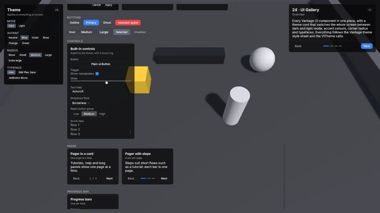
Scene Scenes/24_UiGallery. Assets Kit/UI/VtDemoTheme and Kit/Fonts.
What it teaches
- One theme style sheet on the Panel Settings styles every component.
VtThemeswitches mode, accent, radius and typeface at runtime with classes on the UI Document’s root.- A typeface is a class in your own theme style sheet that sets the
--vt-fontvariables. - Cards in every combination of title, description, header action, content, footer and surface.
VtButtonin each variant and size, with a selected and a disabled button.- Unity’s built-in controls styled by the theme, with the focus ring they draw when you Tab or use a gamepad.
- A pager that shows one page at a time with Back and Next, with its controls in a card footer, once with a page count and once with a bar per page.
- A progress bar in each colour, and nameplates for hostile, friendly and neutral units, a targeted unit and the viewer.
VtIcondraws a glyph from the icon set by its Lucide name, in four sizes and four theme tints.VtBadgepills for a count, a state or a tag, in the outline, primary and danger variants.VtKbdkey caps: plain text, or an action that follows rebinding and switches between keyboard and gamepad.VtListRowrows with a title, a detail line, leading and trailing slots, a caret on focus, and the selected and disabled looks.VtTextlabels that resolve a localization key and format numbers into a line.VtSlotsquares with an icon or a name, a key cap, a count, a caption and a cooldown sweep, in three sizes and the unaffordable, aiming and empty states; two of them count a cooldown down over and over, one radial and one linear.VtToastHostmessages in four severities, fired from buttons through the scene’sVtToasts.VtWindowwith aVtTabViewinside: two tabs with Q and E key caps.VtDialogin three forms: a plain question, a red danger question and a one-button notice, over a scrim.VtTooltipon two slots: an item tooltip with bonuses, an unmet requirement and a value, and an ability tooltip with cost, cast and range.
Assets
| Asset | Settings |
|---|---|
| Kit/Fonts | IBM Plex Sans Regular, Medium, SemiBold and Bold, with its licence IBMPlexSans-OFL.txt. |
| Kit/UI/VtDemoTheme | Imports the Vantage default theme, then the panel style sheets in Kit/UI/Panels. Adds the demo card spacing and title size, theme-aware key caps (border --vt-border, text --vt-muted-foreground), the chip’s selected look as .vt-demo-chip.vt-is-selected (border --vt-primary, fill --vt-hover, text --vt-foreground), row hover --vt-hover, bar track --vt-track, and two typefaces: vt-typeface-plex with the IBM Plex Sans files, and vt-typeface-mono with the package’s JetBrains Mono, Medium standing in for SemiBold and Bold. |
Scene
Ground 30 × 30.
| Object | Setup |
|---|---|
| Main Camera | VtTopDownCamera with Initial Target set to Focus, otherwise the shared layout. |
| Focus | Empty object at (0, 0, 0). |
| Props | Empty object at (0, 0, 0) with four children: Crate, a cube at (-4, 0.75, 2) scaled 1.5 with the Item material; Pillar, a cylinder at (3, 1.5, -1) scaled (1.2, 1.5, 1.2) with the Unit material; Block, a cube at (0, 0.5, 5) scaled (6, 1, 1) with the Dark material; Orb, a sphere at (6, 1, 4) scaled 2 with the Unit material. |
| Demo UI | Lesson card and VtDemoUiGallery with Typefaces Inter (vt-typeface-inter), IBM Plex Sans (vt-typeface-plex) and JetBrains Mono (vt-typeface-mono). |
VtDemoUiGallery builds its layer 20 pixels in from the left, top and bottom and 480 pixels from the right, so the lesson card keeps its column. The theme card is 300 pixels wide with the Window surface; the examples sit in a scroll view 20 pixels to its right and are 260 pixels wide with 16 pixels between them. Under the card examples, a Buttons section shows two rows: Outline, Primary, Ghost and a Danger button reading Abandon quest, then Small, Medium and Large outline buttons, a Selected one carrying vt-is-selected and a Disabled one. A Controls section holds a 340 pixel card titled Built-in controls, described “Styled by the theme, with a focus ring.”, with one of each under a small muted caption: a plain ui:Button reading Plain ui:Button, a Toggle labelled Show nameplates and switched on, a Slider from 0 to 1 at 0.6, a Text field holding Ashcroft, a Dropdown field with Windowed, Borderless and Fullscreen showing Borderless, a Radio button group with Low, Medium and High on Medium, and a 64 pixel Scroll view of eight muted rows. Under them, a Pager section holds two 260 pixel cards: Pager in a card, with a three-page pager and its controls in the card footer, and Pager with steps, the same with Indicator Style set to Steps. A Progress bar section holds a 260 pixel card titled Progress bars with one bar per kind: Primary 0.7, Health 0.55, Mana 0.8, Stamina 0.35 and Experience 0.6. A Nameplate section shows five plates: a hostile Bandit at level 7 and 0.62 health, a targeted hostile Ogre at level 12 and 0.35, a friendly Squire at level 5 and 0.9, a neutral Elder without a level at full health, and the viewer’s own Warden at level 9 and 0.8. Each plate but the Warden’s carries its relation marker in front of the name: a red square, a green circle, an amber diamond. An Icons section holds a 260 pixel card titled Icons, described “Lucide glyphs from the icon set, tinted by the theme.”, with three rows 8 pixels apart: eight medium glyphs — check, x, chevron-right, search, settings, lock, swords and heart — then shield in Small, Medium, Large and Extra large, then circle-alert in the Foreground, Muted, Primary and Destructive tints. A Badges section holds a card titled Badges, described “Counts, states and tags.”, with one row: an outline 3, a primary New, a danger Broken and an outline Elite. A Key caps section holds a card titled Key caps, described “Bound keys follow rebinding and the device in use.”, with a small muted caption “Plain, active scheme, gamepad” over a row of three small caps — a plain F8, Gameplay/Ability 1 in the active scheme, and the same action in the Gamepad scheme — and a caption “Large” over a large cap for Gameplay/Cancel. A List rows section holds a card titled List rows, described “Title, detail, leading and trailing slots, caret on focus.”, with four rows filling the card width: The Sunken Causeway over “Talk to the ferryman”, a large scroll icon leading and a primary New badge trailing, marked selected; Settings with no detail, a settings icon leading and an Esc key cap trailing; Abandon quest over “Cannot be undone” with a destructive trash-2 icon; and Locked over “Reach level 10” with a lock icon and the disabled look. Clicking a row raises a toast with its title. A Text section holds a card titled Text, described “Labels that follow the language.”, with three wrapping labels: “Plain text shows as given.”, a muted “Muted text uses the secondary colour.”, and “{0} of {1} pages read” filled with 2 and 4. A Slots section holds a card titled Slots, described “Icon or name, key cap, count, caption and a cooldown sweep.”, with a row of three Large slots: a swords icon with key cap 1 and caption “20 MP · 1.5s”, the name Cleave with key cap 2 and caption “instant”, and a flame icon with key cap 3 and caption “40 MP · 8s” whose radial sweep counts down from 8 seconds over and over; a second row of three Large slots: a zap icon with key cap 4 and caption “80 MP” marked unaffordable, a target icon with key cap 5 and caption “aiming” marked active, and an empty slot with key cap 6; and under the caption “Medium and Small, with a count and a linear sweep” a Medium gem slot counting 12, a Small shield slot counting 3 at 0.4 of a 2 second cooldown, and a Medium droplets slot whose linear sweep follows the flame slot. A Toasts section holds a card titled Toasts, described “Short messages that fade after a few seconds.”, with four small buttons Info, Success, Warning and Error that show, as title over detail, “Quest accepted” over “The Sunken Causeway”, “Level up” over “You reached level 5”, “Out of range” over “Firebolt” and “Item broken” over “Iron Sword” through the scene’s VtToasts, the titles through their localization keys. A Window and tabs section holds a VtWindow titled Bags, 340 pixels wide, not closable and open from the start, holding a VtTabView with tabs Bags and Character, key caps Q and E, and one line of body text on each page. A Dialog section holds a card titled Dialog, described “A modal question over a scrim.”, with three small buttons: Ask shows “Abandon quest?” with Abandon and Keep, Danger shows the red “Destroy Iron Sword?” with Destroy and Cancel, and Notice shows “Saved” with a single OK; the dialog lives on the root’s Overlays layer, and answering it toasts the choice. A Tooltip section holds a card titled Tooltip, described “Rest the pointer on a slot, or focus it.”, with two Large slots: a swords slot with key cap 1 whose tooltip reads Iron Sword, “Uncommon · Main hand”, Physical power +12 and Attack speed +5% in green, “Requires level 8” in red, Value 40 Gold and a muted line, and a flame slot with key cap 2 whose tooltip reads Firebolt, “Single target”, Cost 25 MP, Cast 1 s, Range 15 m and a muted line.
Build it yourself
- Build the scene as in Build the shared layout with a 30 × 30 Level. This scene uses no prefabs.
- GameObject → Create Empty, name it Focus, at (0, 0, 0), and set it as the VtTopDownCamera Initial Target.
- GameObject → Create Empty, name it Props, and add the four primitives above as children, removing nothing.
- Put the IBM Plex Sans files in
Kit/Fonts, and add the typeface classes to your theme style sheet as in UI. - Add a UI Document with the demo Panel Settings, VtDemoCanvas, VtDemoLessonCard and VtDemoUiGallery, and fill Typefaces with the three rows above.
Try
- Switch to Light: the lesson card, the theme card and every example follow.
- Pick an accent and a radius, then a typeface. Card titles keep their weight in every typeface.
- Press F8 to hide the gallery and look at the scene behind the HUD surfaces.
- Page through the lesson card and the pager example with Back and Next. The lesson card’s Next is a primary
VtButton. - Press Tab, or push a gamepad stick, to move focus through the controls: each one draws its focus ring.
- Scroll the examples column to reach the pager, progress bar and nameplate sections.
- Press a gamepad button, then a key: the key cap next to Plain switches between the keyboard key and the gamepad button.
- Tab onto a list row: the caret in front of it lights up.
- Watch the flame slot: its sweep turns clockwise from 12 o’clock as the seconds count down, and the droplets slot fills from the bottom in step.
- Click Info, Success, Warning and Error: each toast stacks at the bottom of the screen as a card with the severity’s icon in its colour, a title and a detail line, and fades and drops after three seconds.
- Click the Bags and Character tabs, then press Ask, Danger and Notice: each dialog darkens the screen, and Esc or the scrim cancels the first two.
- Rest the pointer on the sword or the flame slot, or Tab onto it: the tooltip appears under it after a moment.
In your own game
- Put the Vantage theme, or your own that imports it, on your Panel Settings.
- Call
VtTheme.SetMode,SetAccent,SetRadiusandSetTypefacewithUIDocument.rootVisualElementfrom your settings screen. - See UI for the variables, the classes and the card.